Data Visualizations and Infographics
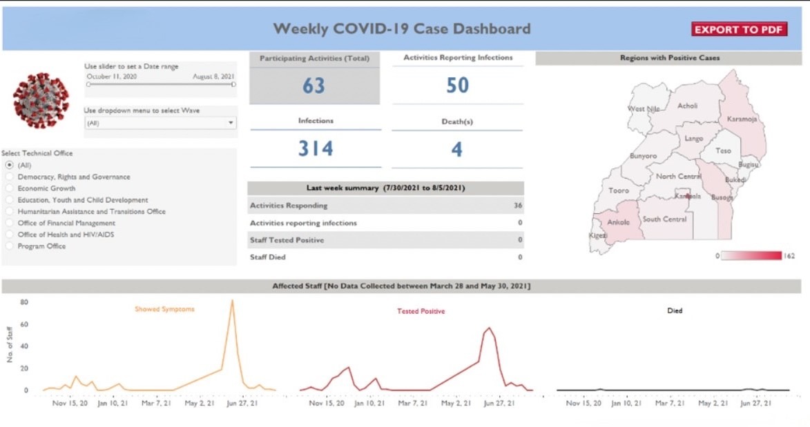
Weekly COVID-19 Reporting Dashboard
I developed the Weekly COVID-19 Reporting Dashboard to capture the pandemic’s effects across Uganda. The dashboard tracked key data points such as new infections, deaths, sectors most affected, and coping mechanisms used by respondents. It also featured an interactive map showing case locations, helping the client make data-driven decisions.
Initially, data was collected via a Qualtrics survey and analyzed using a custom R script, with visualizations created in Excel and reports written in Word. I streamlined this process by designing an interactive dashboard in Tableau that replaced the PDF reports, making the data more accessible and actionable. The tool was updated weekly for over a year, providing real-time insights to guide decision-making.

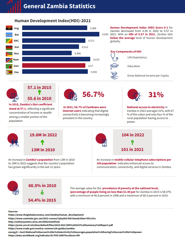
Zambia Data Book
I designed a Zambia Data Book in Venngage for a client preparing to onboard new staff from diverse backgrounds. The data book was used during orientation to highlight key socio-economic and health indicators in Zambia, including HDI, poverty rates, youth unemployment, GDP per capita, government effectiveness, health statistics (e.g., maternal health, HIV/AIDS prevalence, malaria), and education metrics. The statistics were sourced from reputable organizations such as the World Bank, DHS Program, Ministry of Health, and The Global Economy. This tool provided new staff with an insightful overview of Zambia's key national indicators to help them better understand the country's context and challenges

Post a comment